Clarity Corporate Identity - Digital Artists Magazine

Digital Artists Magazine

Digital Artists Magazine featuring great design, architecture, fashion, graphics and innovation from across the globe.


Clarity

Clarity is a corporate identity designed for a technology company. The logo combines two symbols used in coding, placed within a triangle that conveys onward movement. A dark blue tone communicates trust, while a bright blue tone refers to technology. The typeface Neo Sans is used for its modern appearance, which pairs well with the rounded corners of the logo. Gradients and abstract forms are avoided, so the identity relies on simple shapes and coding characters. The identity is also applied to corporate merchandise.

Continue reading
 

World's best designers, artists and architects.

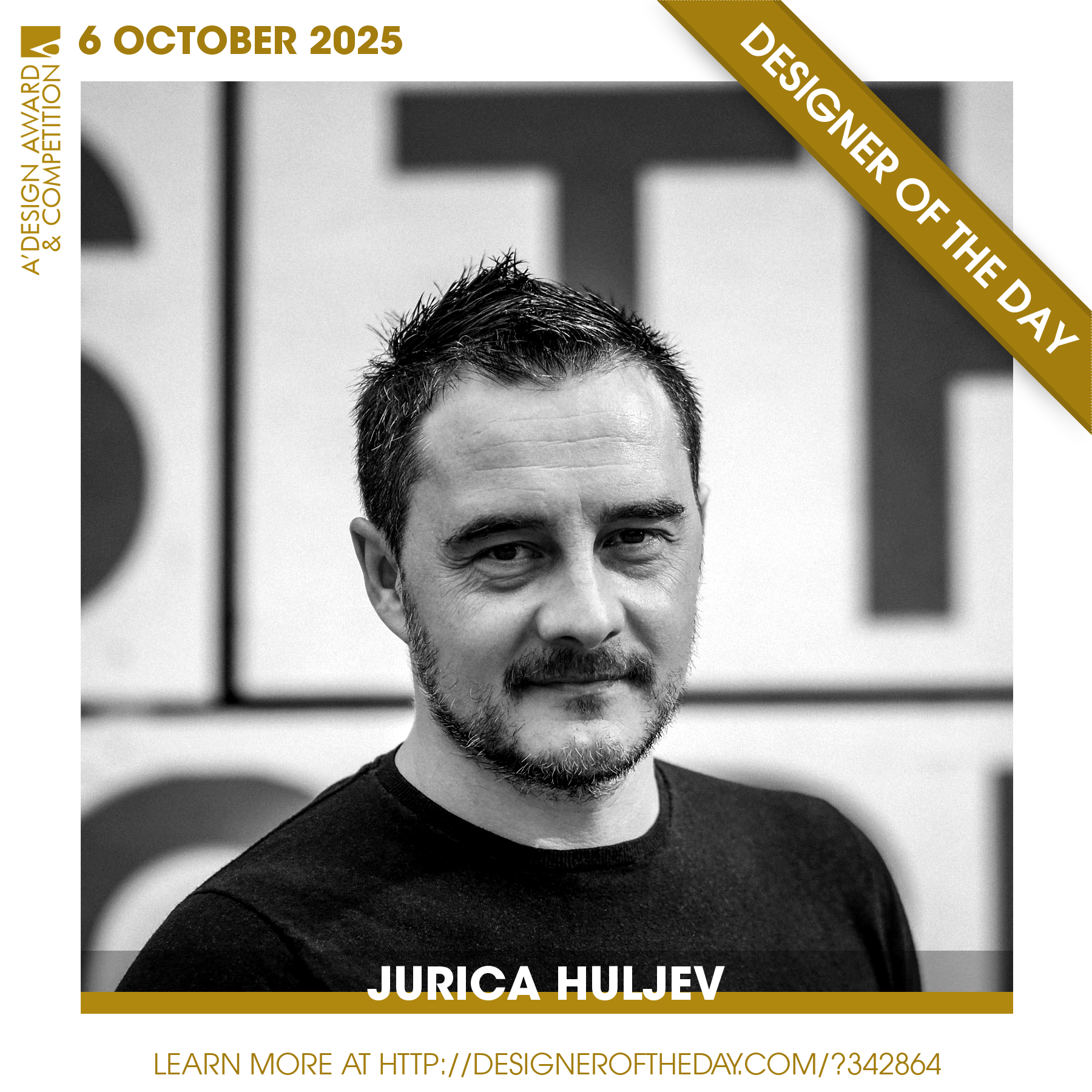
Good design deserves great recognition. Everyday, we are pleased to feature amazing designers who create original and innovative designs, amazing architecture, stylish fashion and creative graphics. Today, we are presenting you one of the World’s greatest designers. Checkout an award-winning design portfolio today and get your daily design inspiration.

Continue reading
