Digital Artists Magazine

Digital Artists Magazine

Digital Artists Magazine featuring great design, architecture, fashion, graphics and innovation from across the globe.


Black Beans

When two award winning Marketing Agencies decided to merge into one, Black Beans was created to join forces in delivering the best digital marketing in Sao Paulo. The challenge was creating an identity matching a premium, elegant, modern logo that depicts its elevated position in the digital market. The logo approval came directly from the agency directors, putting the brand into use immediately.

Continue reading
 

KK-Park

Located in the China-South Korea (Yancheng) Industrial Park, the site of a former playground, after renovation, was restored to a Sino-Korean cultural exchange leisure block. The site's mission is to publicize the city brand and promote South Korean culture. China is correlated with South Korea in terms of history and culture. The design deconstructs and rebuilds the Korean elements such as iconic ribbons of traditional Korean costume, the traditional Korean color "Obangsaek" and strokes characteristics of Korean characters.

Continue reading


Eastern Seawall

The Eastern Seawall project was to connect 6 areas visually by unified signage systems, creating a unique experience for visitors to enjoy native features and vitality. While avoiding intrusive design, designers took "reading on the way" as a main design concept. It provides visitors with a fresh, interesting, and complete experience to read information, such as signboards, site maps, and ecology introductions for roads and entrances. Modular structures were adopted to meet the needs of different venues.

Continue reading


Unajiro

It is created the visual identity of Eel Jiro, created logos, and design them in total, from decorations to goodwill and lanterns; from chopstick bags to aprons. They were particular about the recycling mark of the chopstick bag. It is an acronym for U in Japanese katakana, U in hiragana, Umai which means delicious, and an acronym for eel. Visual identity is Japanese craftsman-like design. It wanted to put importance on the Japanese style. The prosperous business on the front cover is a wish that business will go well.

Continue reading


To Beauty

To is a skincare brand inspired by the life and mystery of the cosmos and the meditative experiences of the spirit. A mystical color palette, organic symbology that expresses the pulse of life, even the inside the cap, which receives little attention, is beautifully designed in a crescent shape. The specially structured screw nozzle of the facial cleanser ejects an ideal dense foam with a single push, which maintains elasticity for a long time and reduces skin irritation from friction. The eyelash beauty serum uses an innovative airless container that is preservative-free and hygienic.

Continue reading


Stacked Glyphs

In Chinese culture, a special type of character called Stacked Character refers to the character formed by overlapped glyphs. Most of these superimposed characters are uncommon and are gradually replaced by commonly used characters nowadays. So that Stack Glyphs constructed the characters using graphical symbols, collected these lost chinese characters.

Continue reading


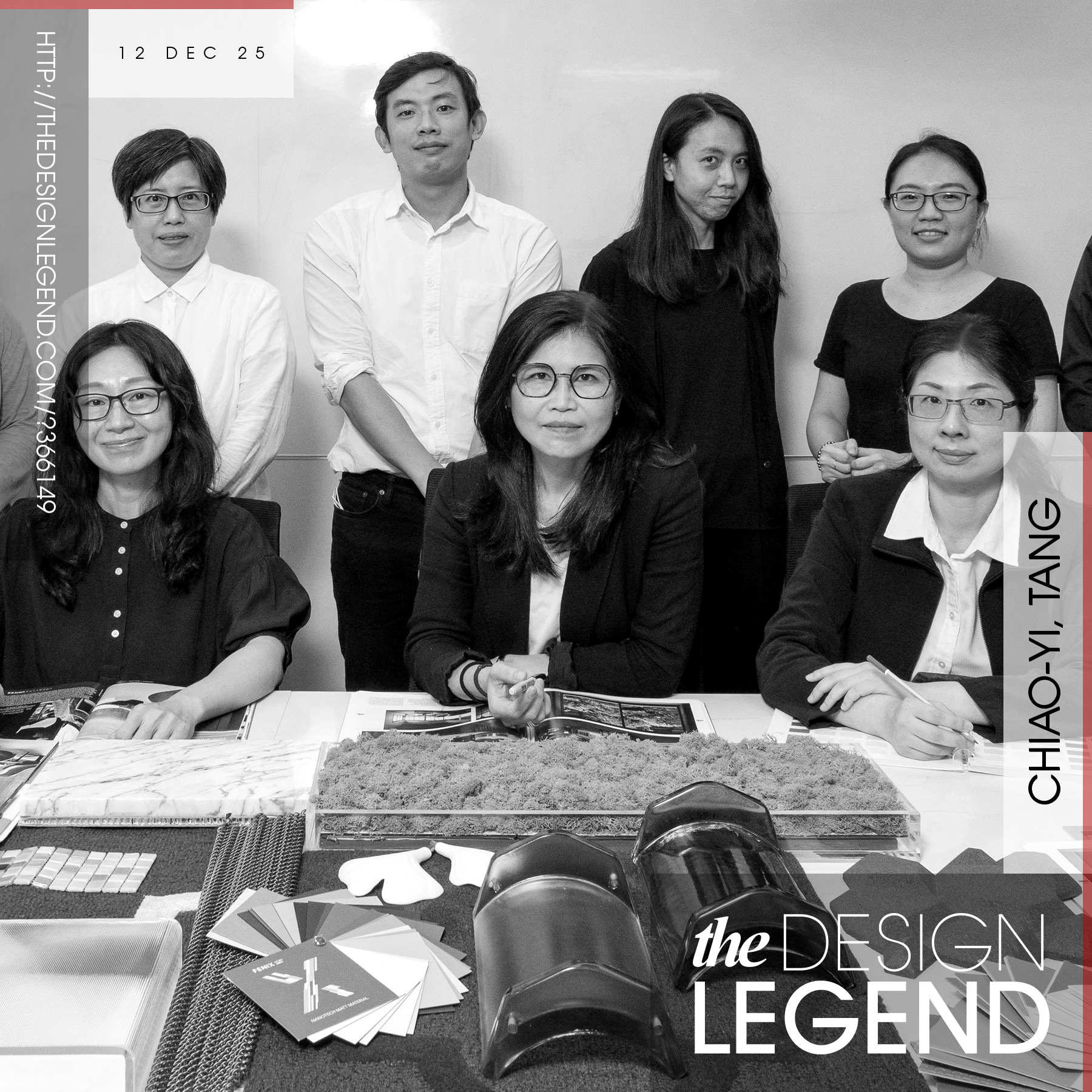
Legendary designers and their award-winning works.

Design Legends are extremely famous designers who make our World a better place with their good designs. Discover legendary designers and their innovative product designs, original art works, creative architecture, outstanding fashion designs and design strategies. Enjoy and explore original design works of award-winning designers, artists, architects, innovators and brands worldwide. Get inspired by creative designs.

Continue reading