Digital Artists Magazine

Digital Artists Magazine

Digital Artists Magazine featuring great design, architecture, fashion, graphics and innovation from across the globe.


Limited Space

Limited Space is an good photography design. The work shows some emotions and behaviors of long-term homebound people in limited space during Covid-19, thus evoking empathy and evoking some reflections on the past and cherishing a healthy life in the future. Those who have seen this set of photos may feel the urge to tear off the gray film, which is exactly what he wants.

Continue reading


Drive2Extremes Multivision

Photographer Florian W. Mueller was invited to bring together the two extremes of the northern polar region in Levi, Finland, and the Arabian desert in Liwa, UAE, with the Porsche Taycan Cross Turismo. He positioned the new, electric Porsche first on ice at -25 degrees Celsius north of the Arctic Circle and then in the same position to the camera and at a similar sun angle in the Arabian desert at +42 degrees Celsius and brought the two images together. Partial multiple exposures were added in the manner of his Multivision artworks.

Continue reading


Multivision Porsche Shanghai

For Porsche China Florian W. Mueller shot in Shanghai and created some artwork for the Photofairs Shanghai, including iconic sportscars. Shanghai has many different faces. The old, traditional China, the influences of France in the "Former French Concession" and very modern glass and steel architecture. The photographer wanted to capture these different faces of the city in multiple exposures, always with a car in the picture. Because no matter how distorted the environment appears through the multiple exposure, you can always recognize the iconic design of the Porsche.

Continue reading


Bank of England

Designing for a central bank means finding a balance between technical and sensitive information, staff-led outputs, engaging general communications, and a series of regulations. This is not simple to achieve and it is based on delicate internal dynamics. The new identity has been developed together with the people who will use it, balancing all the aspects of the communications. It focuses on reaching a wider public with an accessible, relevant, structured, and distinctive approach. These key principles have been used as a design direction for all the visual assets.

Continue reading


Shenzhen Jiangangshan Hill Park

Henri Rousseau's impressionist style is ingeniously applied as the main visual elements into this project. Wayfinding signs are designed as interesting impressionist-illustration silhouettes here and there in the park, creating a tranquil eco-friendly hilly aura for visitors. The artist's thoughts and the project's purposes are brought into resonance by the concept of harmony between human and nature.

Continue reading


Moscow Ambassadors School

Interesting stories are hidden behind every turn of the old streets and it is impossible to associate the City with any one minimal set of recognizable symbols. While studying the city, the future ambassador discovers it anew, like a student discovers a primer at school. For the construction of the identity, a typographic solution was chosen, based on the principle of typographic eclecticism: the Old National script, interspersed with the cursive script and recognizable fonts of the avant-garde artists. The color scheme is laconic-bright red.

Continue reading


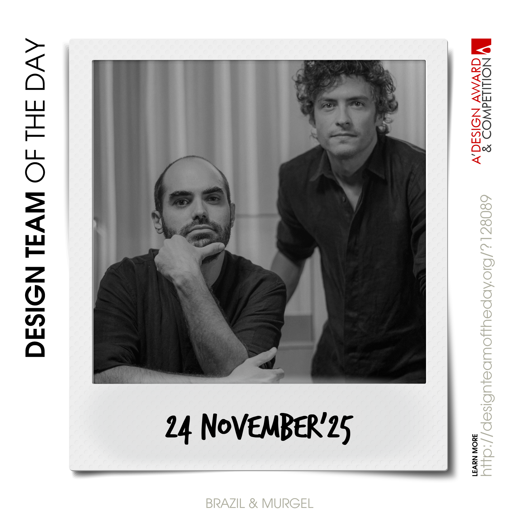
World's greatest design teams.

Sometimes you need a very big team of talented designers to come up with truly great designs. Everyday, we feature a distinct award-winning innovative and creative design team. Explore and discover original and creative architecture, good design, fashion, graphics design and design strategy projects from design teams worldwide. Get inspired by the original works by grand master designers.

Continue reading